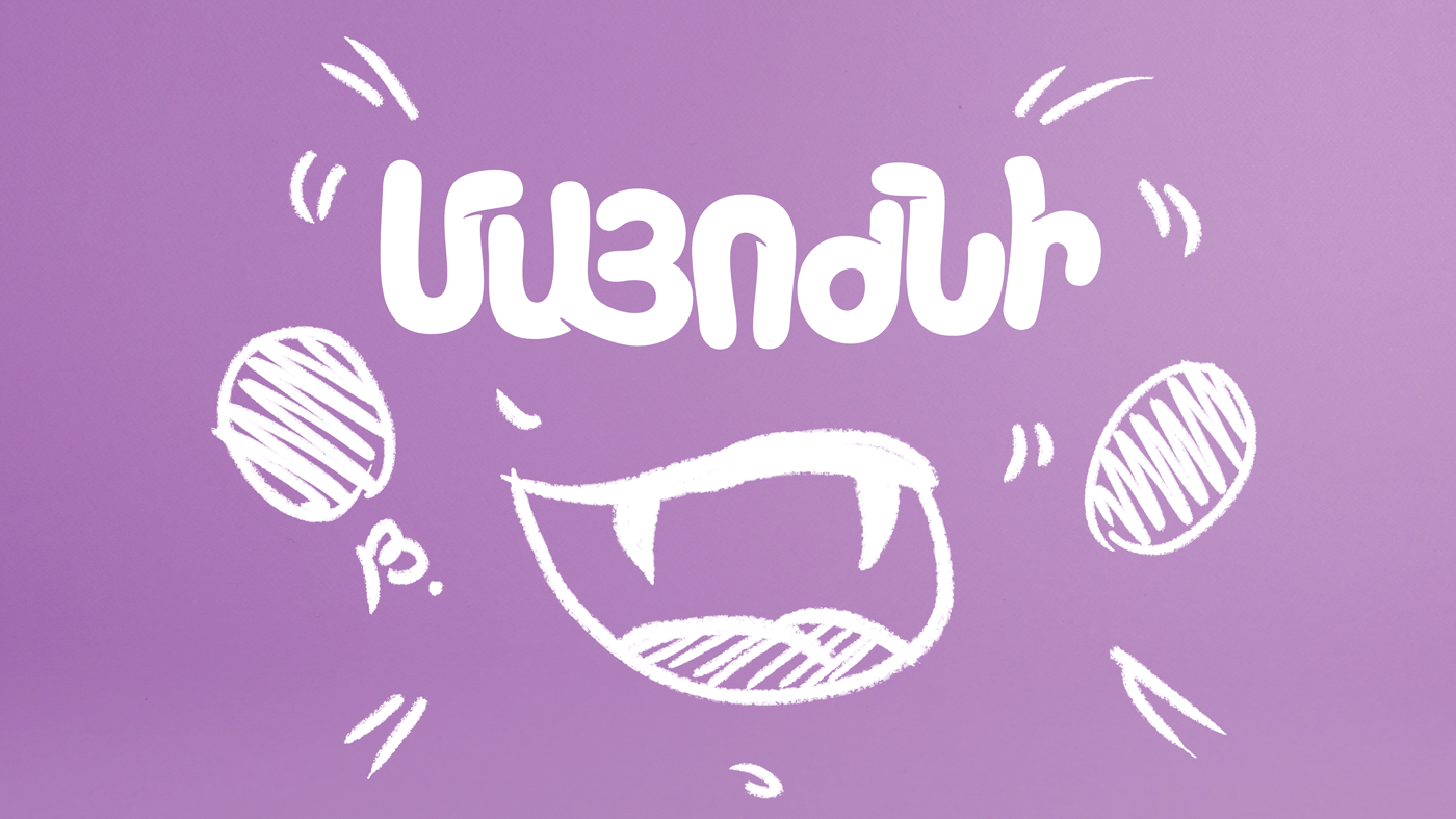
Concept
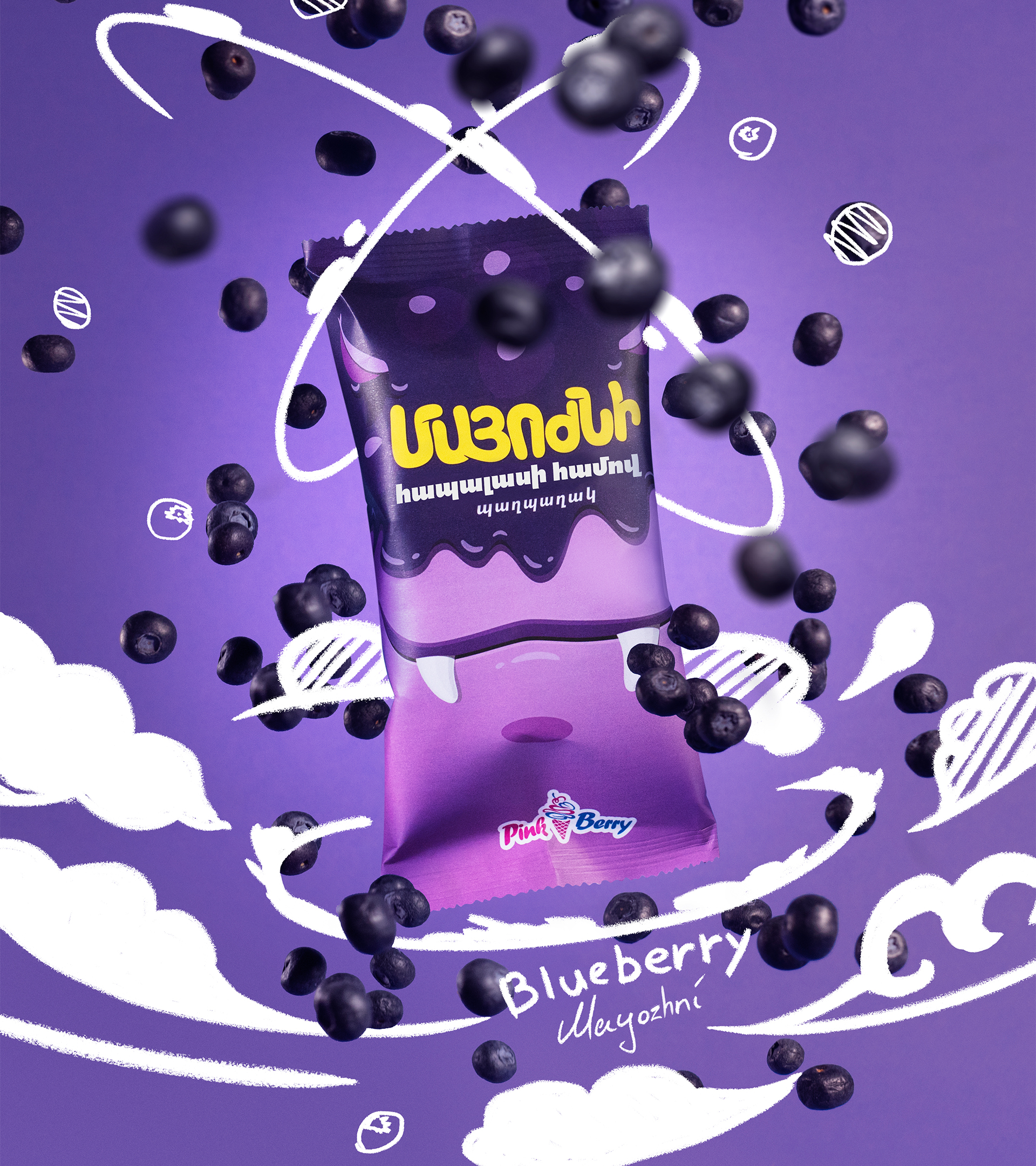
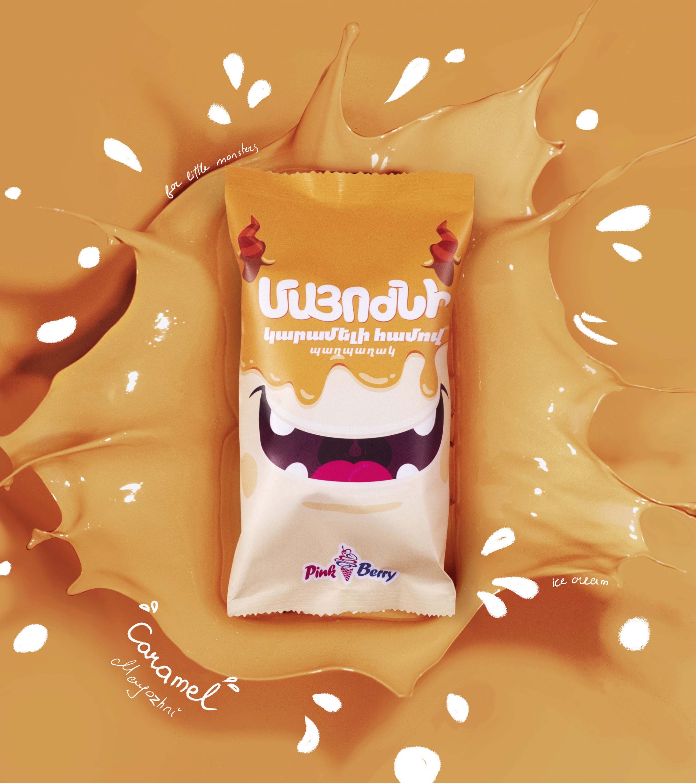
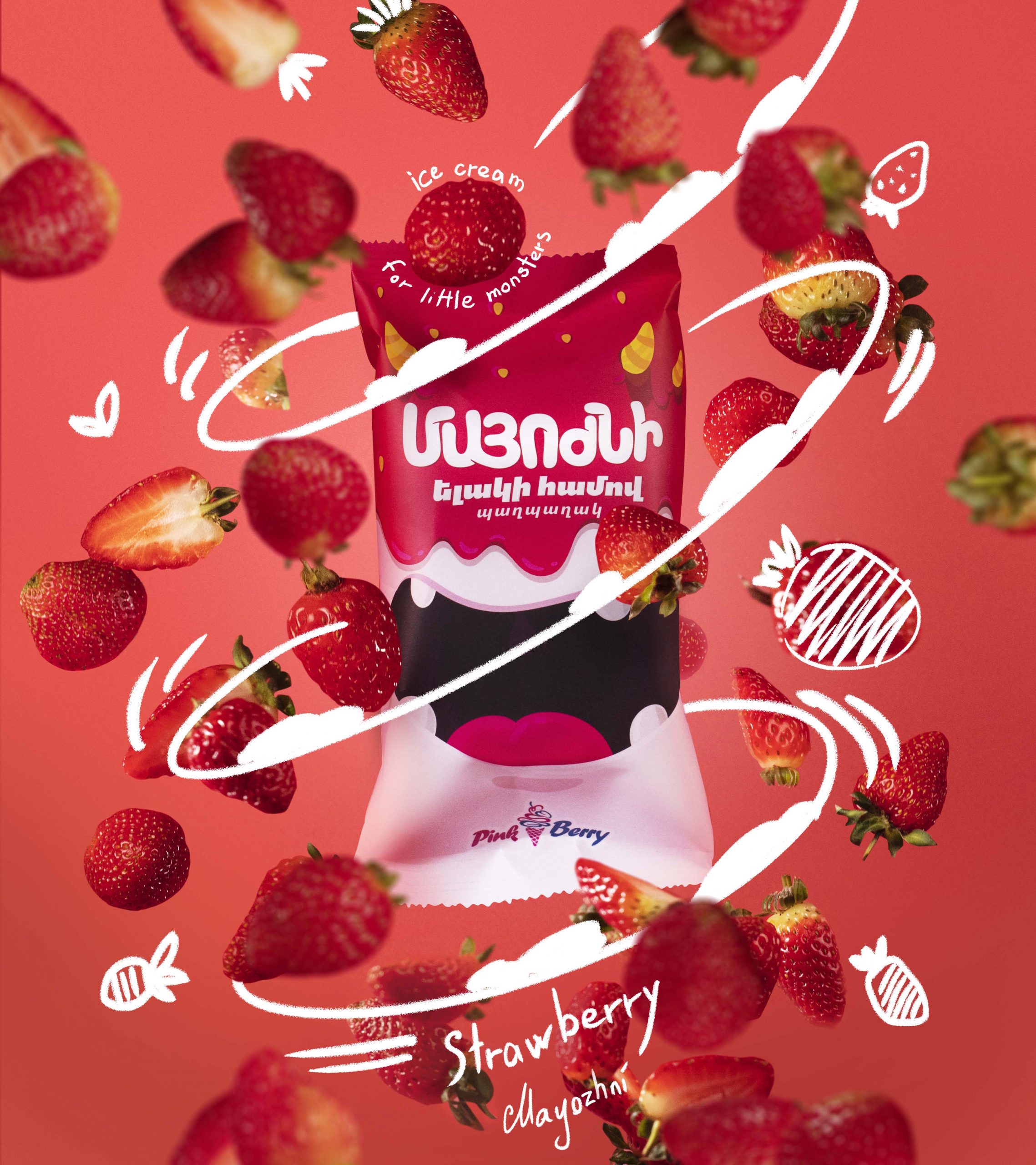
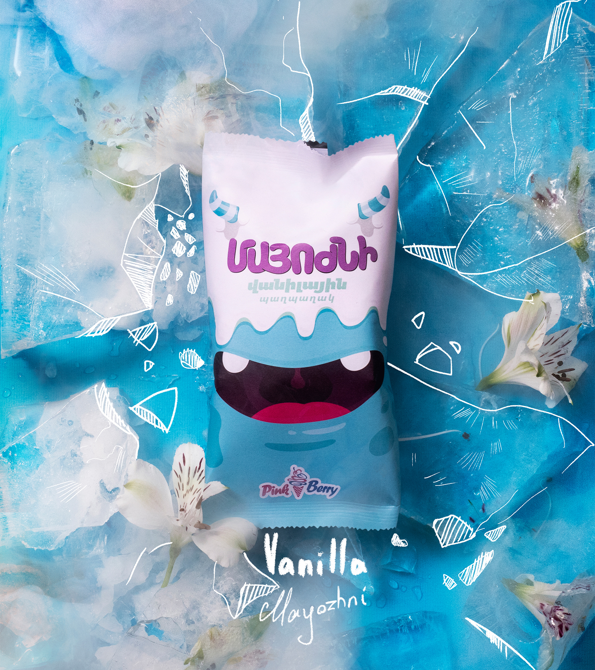
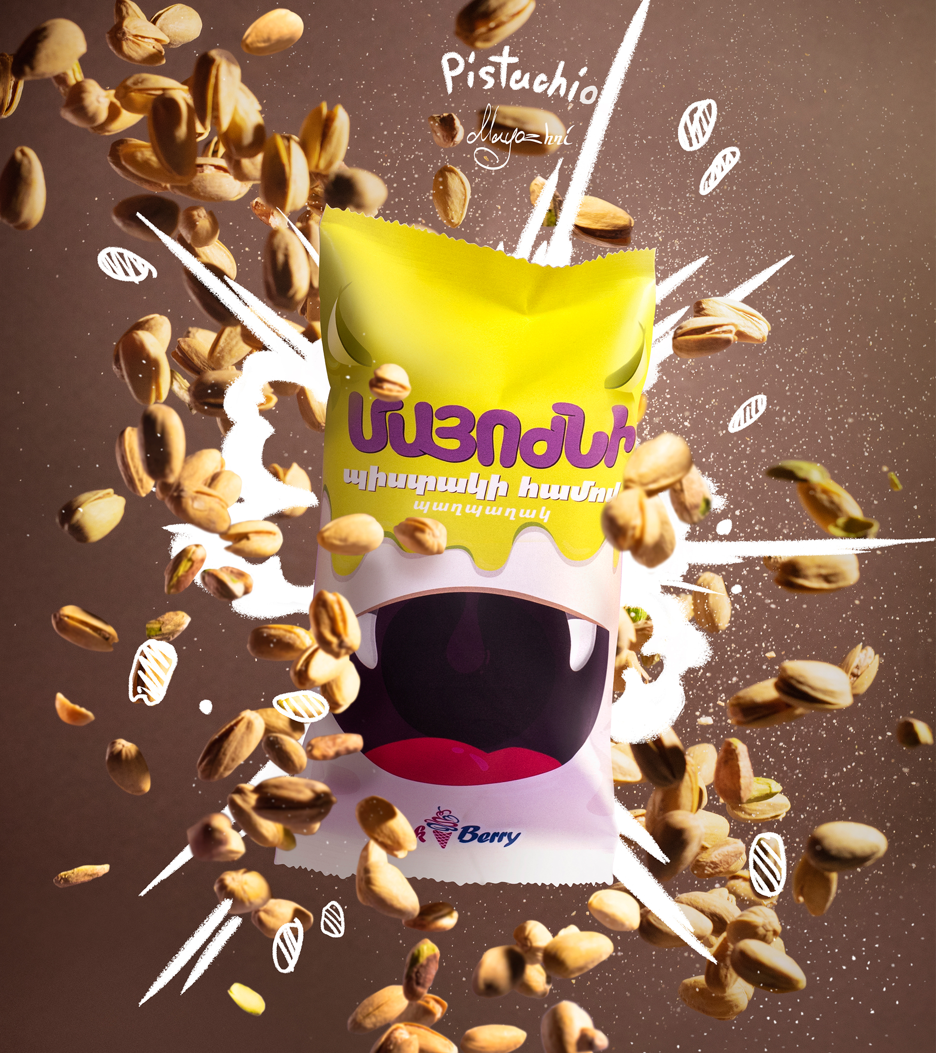
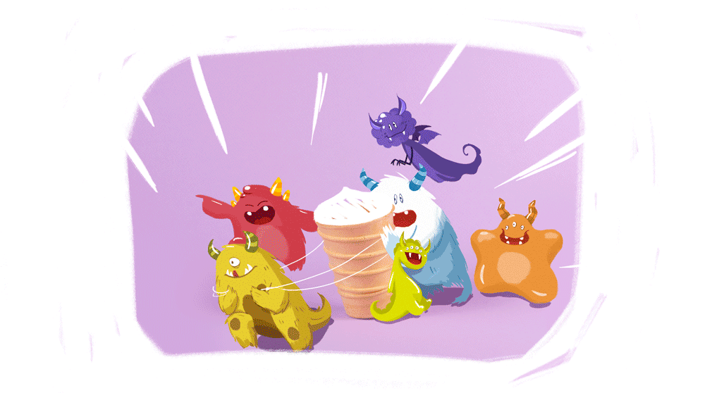
How to contain our little monsters? Of course with ice-cream. Sometimes children become obstinate little monsters ready to do anything to have their way. They stamp, shout, run around, and wreak havoc, making their parents’ lives a nightmare. Those little monsters even have their own language, where the word for “ice-cream” becomes “mayozhni”․ They won’t stop screaming “I WANT MAYOZHNI!” in the store until they get one. Only then do they turn back into ‘sweet little angels.’
* “Marozhni” is a common slang word in Armenia for “ice-cream,” and children often mispronounce it as “mayozhni” (pronounced “mah-yozh-nee”).
Implementation
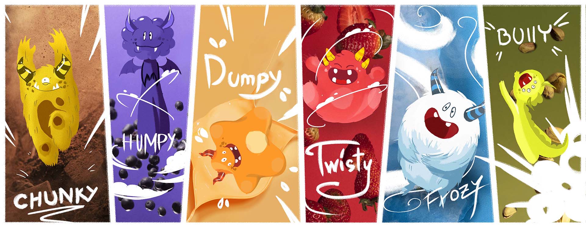
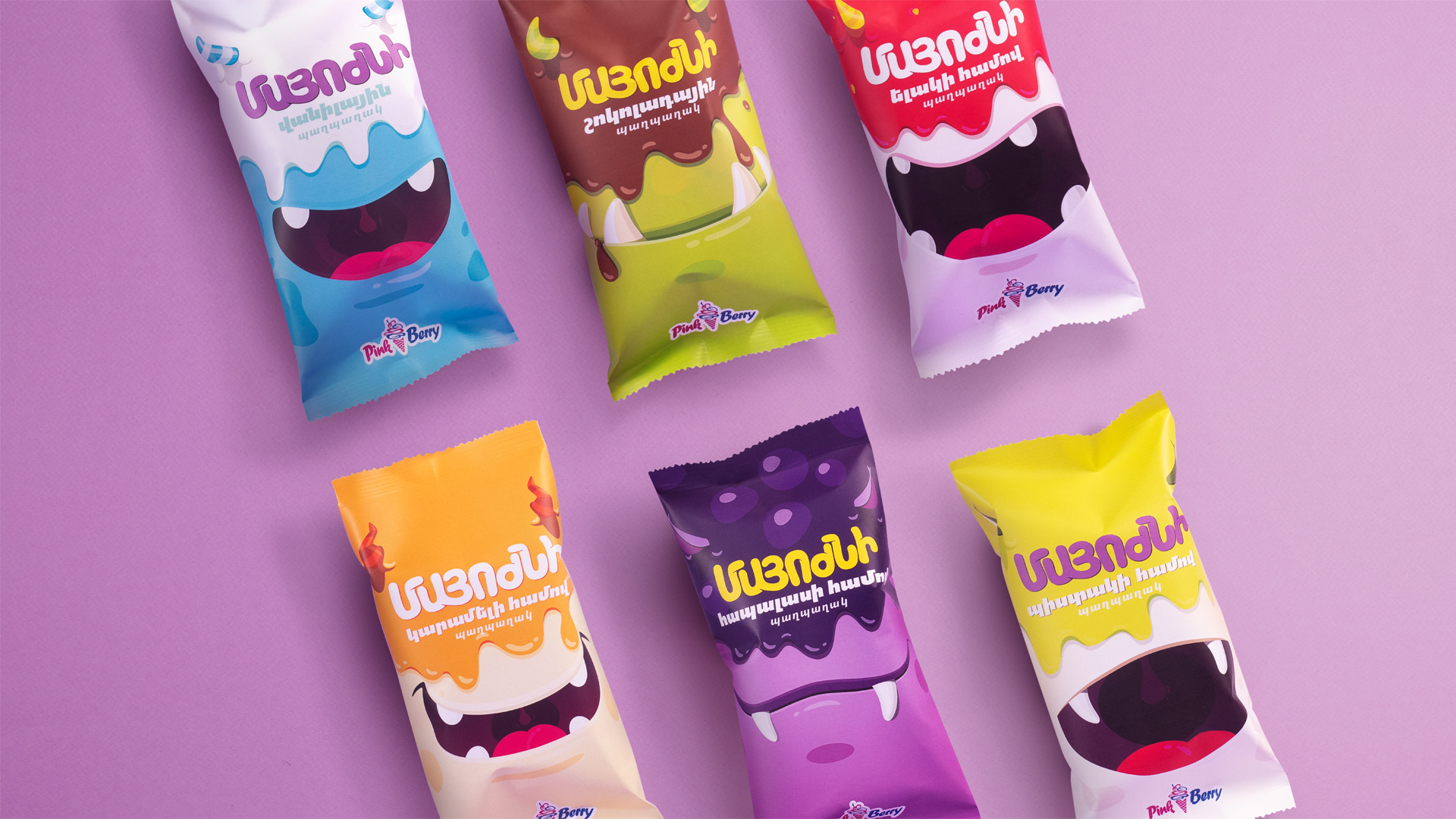
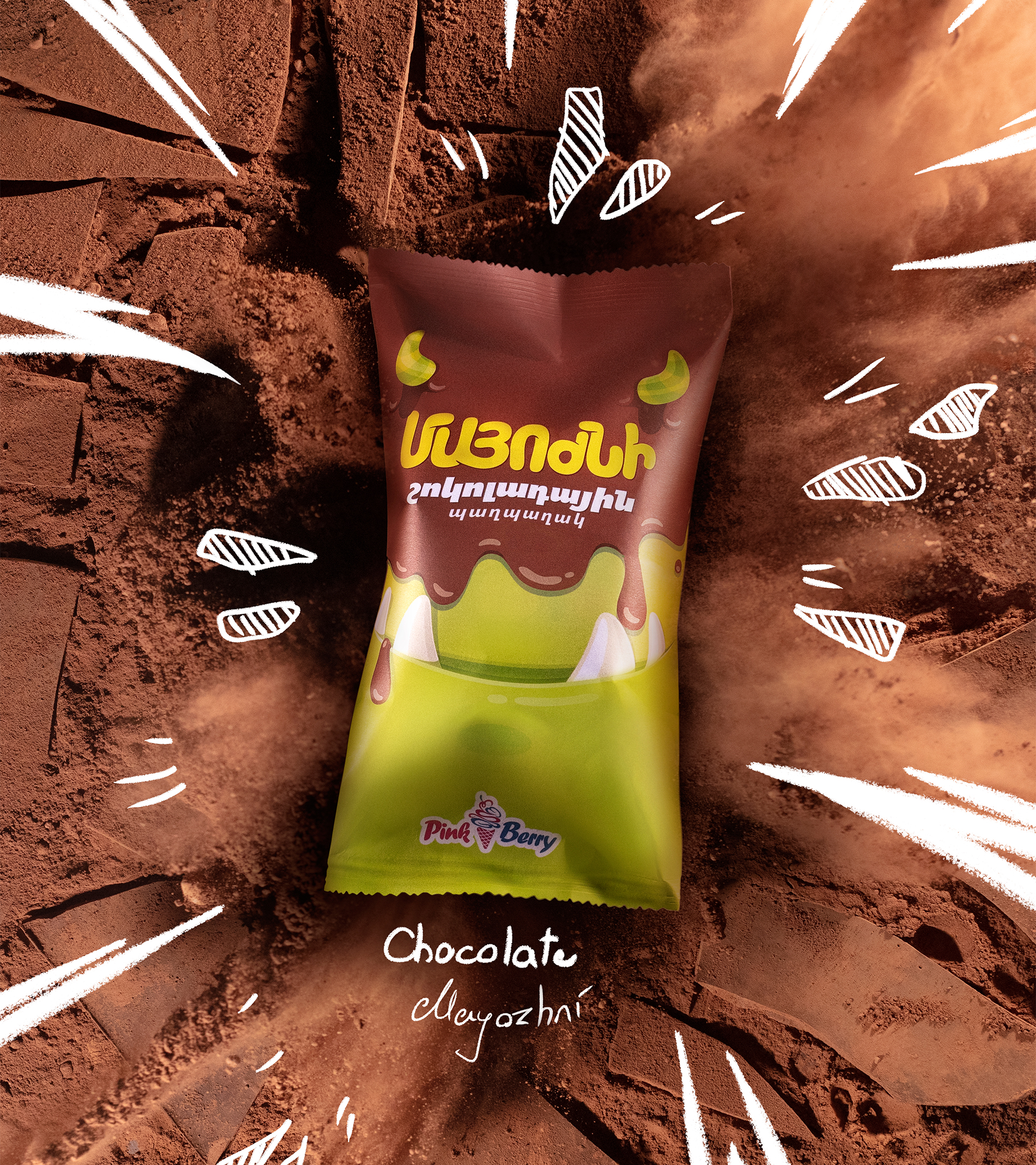
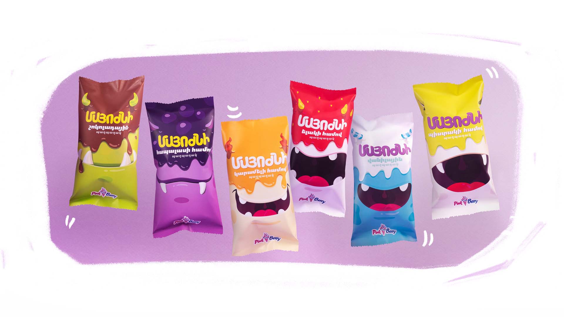
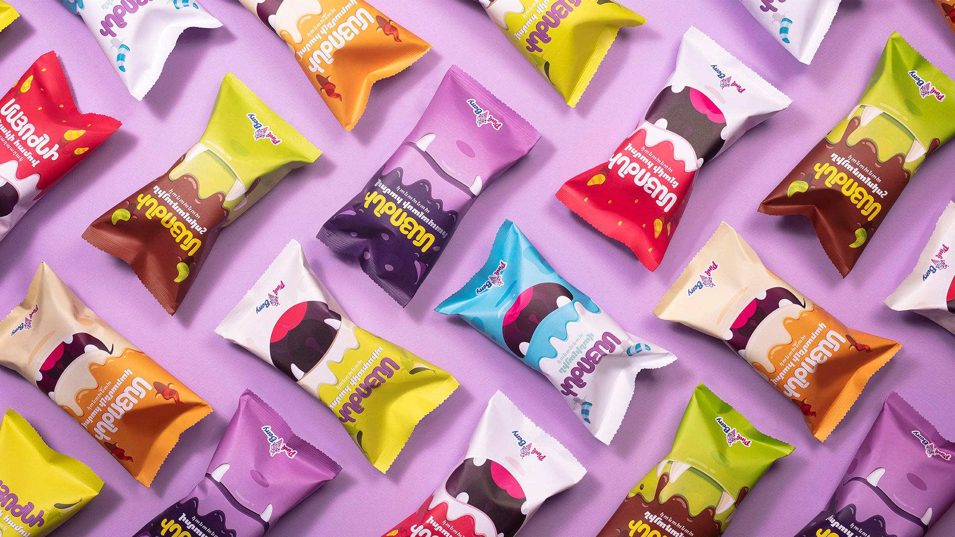
The ‘little monsters’ are the primary target audience for Pink Berry’s new line of ice-cream cones. To connect better with the target group, we named the new product line after their own word for ice-cream: “Mayozhni.” For the packaging, we created cute little monsters that represent children being lively, mischievous, happy, naughty – or just children being children. Each flavor is a specific monster with its own characteristics: a cheerful smile, a set of silly teeth, devilish horns, etc. Flavors are differentiated through a wide color palette, making the product more appealing to our target audience. Children pick their “Mayozhni” based on either the flavor or the monster design. But in the end, when they finally get what they want, those little ‘angels’ dip ice-cream all over their clothes, becoming ‘colorful little monsters’ in the eyes of their parents.