Idea
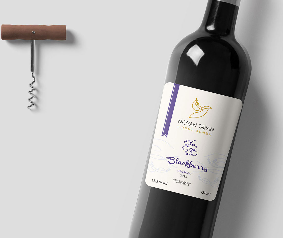
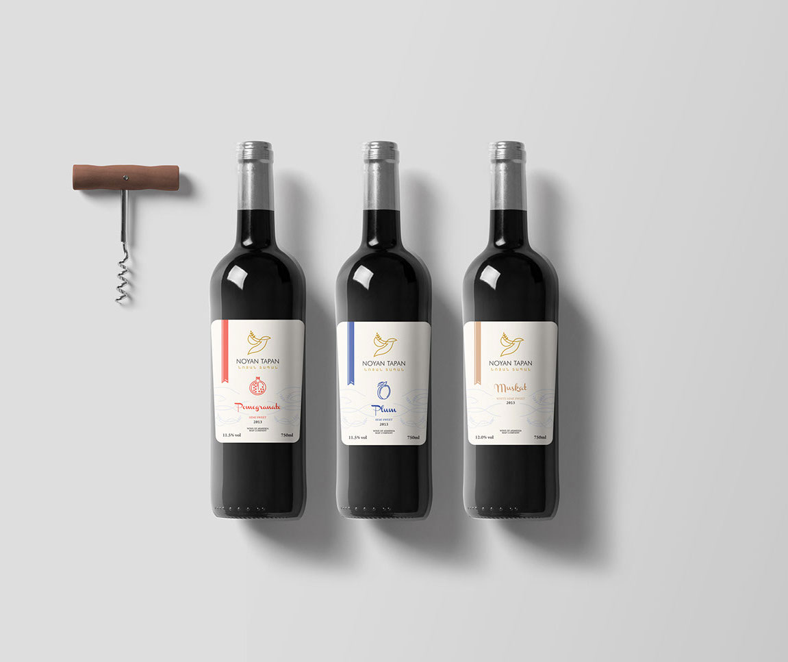
To develop a new label design for MAP company’s new “Noyan Tapan” wines, the focus was mainly put on the name. What could be more associated with Noah’s Ark, if not that very ark and the dove bearing an olive branch? It’s these symbols that became the core of visual design. This resulted in the black ark and the graphic image of the dove with an olive branch coming out of the white background intended for the labels of pomegranate, quince, and cherry wines.


