Brief
Equiti Group Ltd is the parent company of some of the most progressive FX and CFD brands as well as one of the prime brokerage providers in the industry. During the process of creating a brand identity for Equiti Group, we were challenged to think outside the box to offer a solution that emphasizes Equiti’s innovative, unique operating, and well-capitalized systems. Another challenge was also put in front of our team to include a hidden element in the brand identity to give it a unique sense.
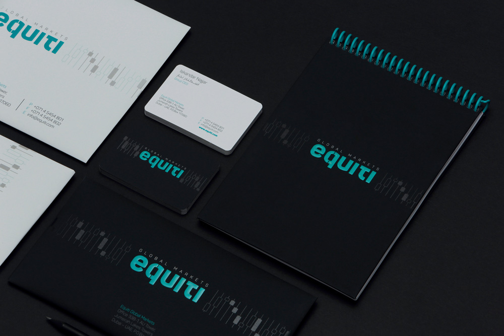
Solution
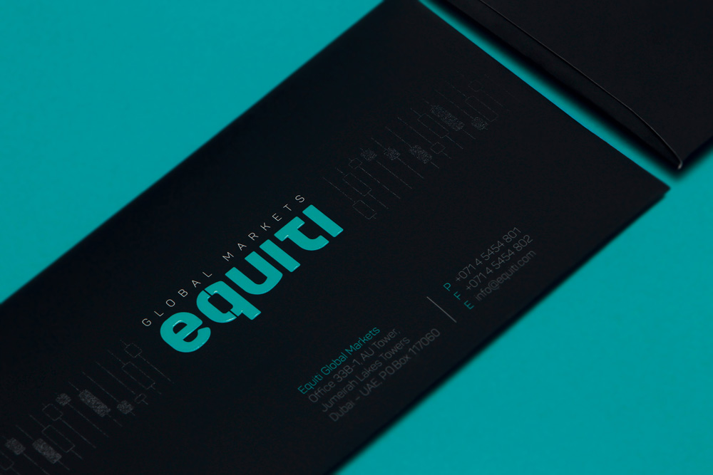
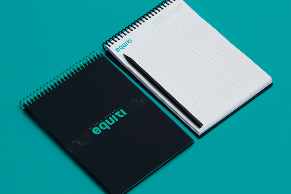
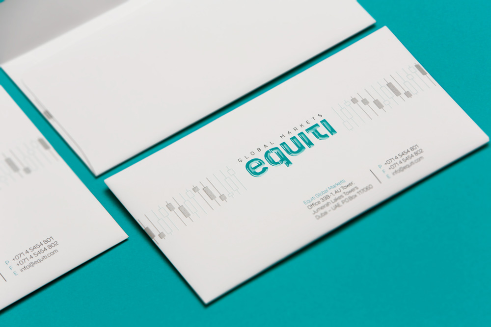
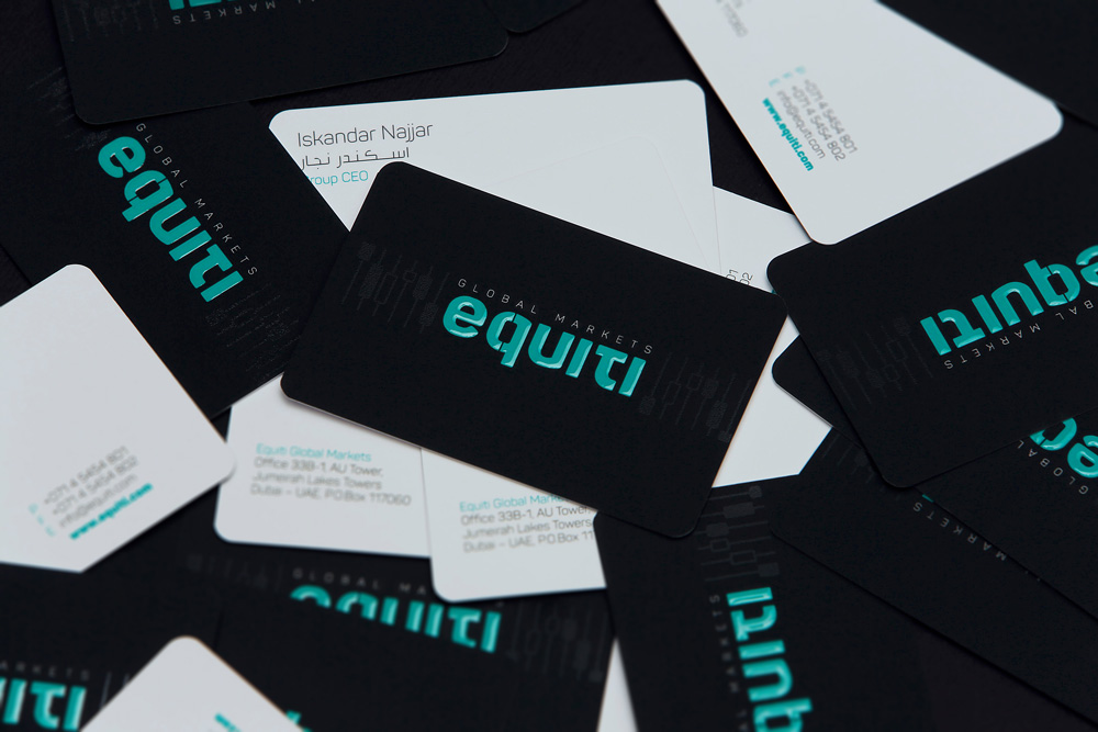
A brand’s identity needs to showcase many different elements of an organization. Therefore, we went above and beyond what was necessary to achieve this, incorporating some visual tricks to fit all of the elements. Minimalism and simplicity became inseparable parts of the new brand identity. Furthermore, black and turquoise became the representative brand colors. As for the hidden element, we used the Japanese candlestick chart, which is a style of financial chart used to describe price movements of security, derivatives or currency. Technically, we made the brand elements flexible and usable as part of a pattern or as a big fragment, wherein not violating the identity character. We believe that the new logo and brand identity offered by Doping has taken the business to the next level, allowing them to be more successful and recognizable in the international market.